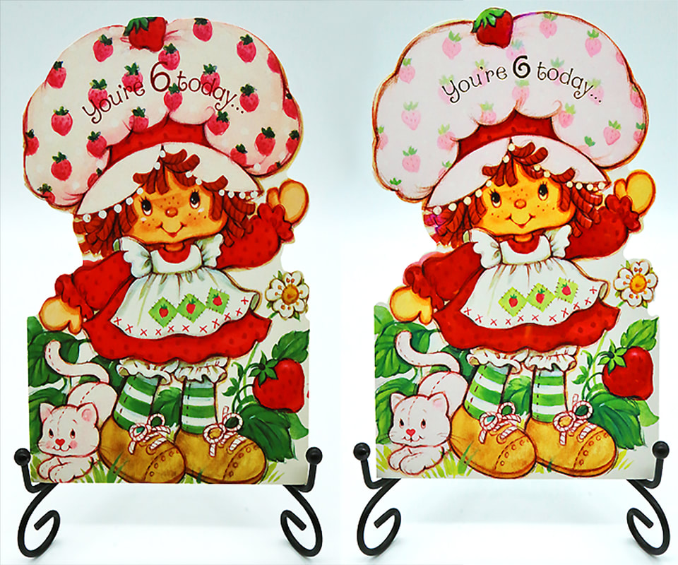
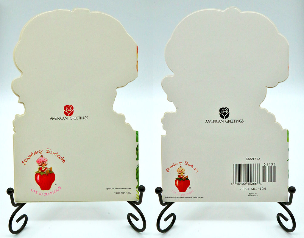
I had promised to do a side by side comparison of these two cards. So here they are. I wanted you to be
able to tell the difference from the vintage and the modern version. Besides the obvious markings on the back
of the card, there are other important differences. The number 6 on the front of the card is different as far
as the font used. Also the modern one has gold foil instead of the red foil that the vintage one has.
You can also see that there is a big color difference and lack of details on the strawberries
printed on Strawberry Shortcake's hat. The details of her face are very faded on the modern one to the right. You
can hardly see the shadowing or the highlights that are nice and crisp on the vintage one to the left.
Also as I mentioned before in my earlier post, the vintage versions die cut was not done correctly.
Miss. Shortcake's strawberry at the top of her hat is chopped off and so are the tips of her shoes.
There are hardly any differences on the inside of the card that would be a great help to id them.
I will just mention that the Vintage version has the inside message is black and the modern one's message is in red. Lastly
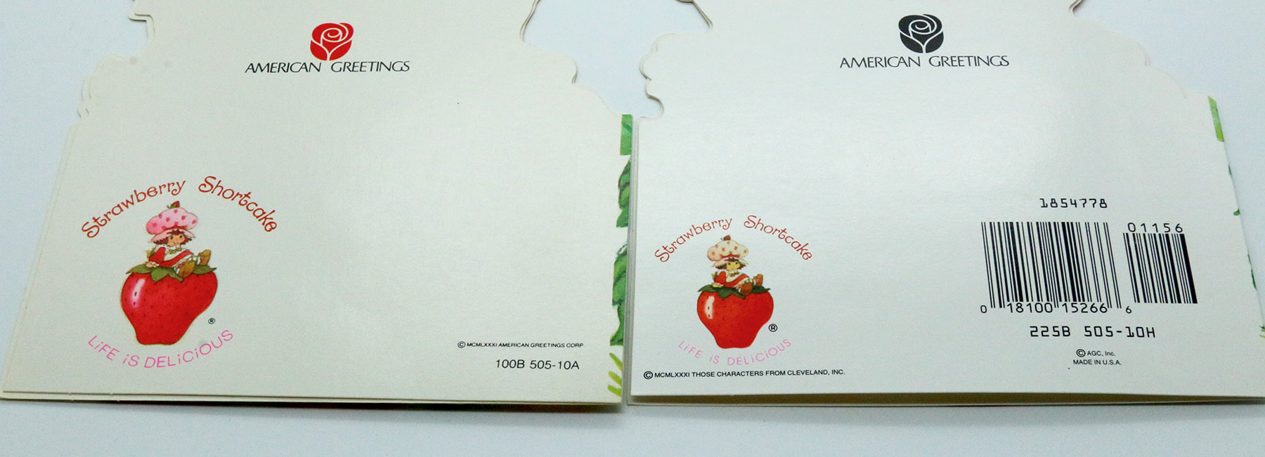
the vintage version of the card has the American Greetings rose in red with the modern one is a black rose. On the bottom
left corner they both have the SSC LIFE IS DELICIOUS picture logo, but the one on the vintage card is larger and very crisp and focused. The modern remake has it faded and blurry and smaller sized. Below that you can see the Roman Numerals for 1981 Those Characters From Cleveland, INC.. Then to the right the vintage one has in Roman Numerals 1981 American Greetings Corp. The modern version has a big bar code and below that another copy right AGC INC. MADE IN THE USA.
They are definitely quite different. I love having both versions, but i'm definitely partial to the vintage one.
Hope you enjoyed this time comparing cards with me!


